


Tweaking map visibility. Decide which one you like more in terms of looks & discernibility of walkable areas: A) 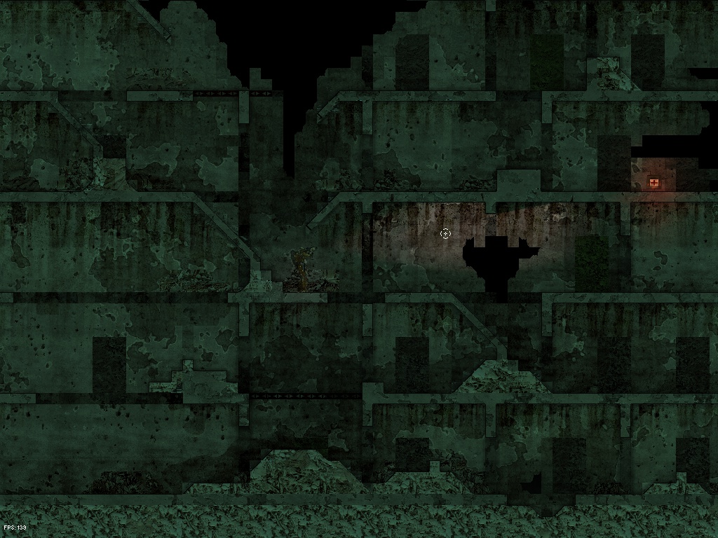 B)
B) 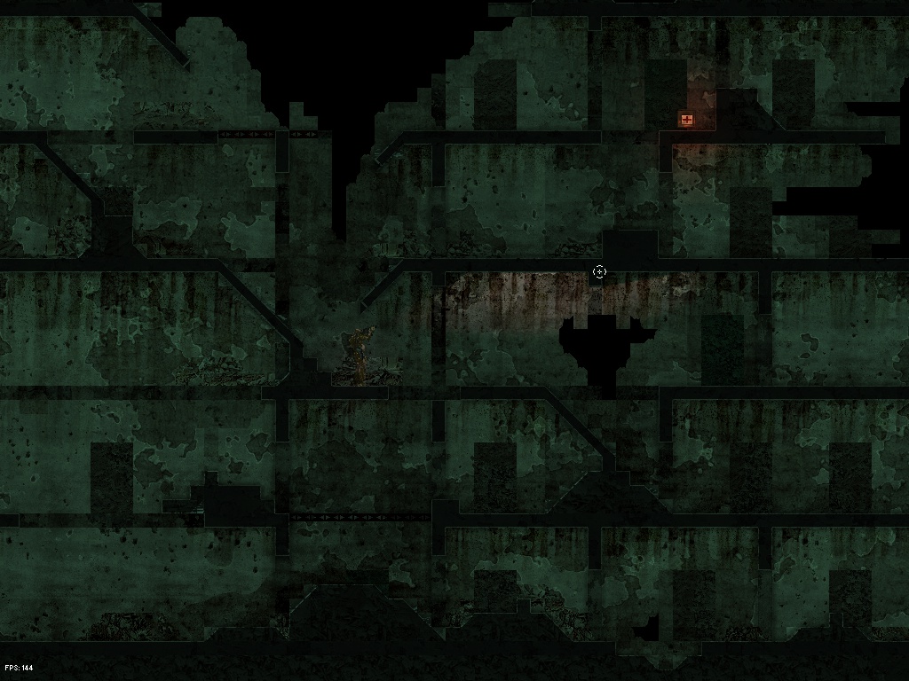
Written by MM. Posted at 4:41 am on March 29th, 2010


19 comments.
Post a comment.
A by far.
I like B more (because of the strange patters on the bottom of A). But can’t you let the mapmaker decide the look? Some maps A, some maps B.
B looks better but A is more clear about walkable areas.
If you ask me, B (dark platforms)looks more natural. It makes the map look better overall. It is also better for visibiity because the bright edges are more distinguiashable.
The dark edges in A (light platforms) blend with the shadow of the platforms, making it harder to pinpoint the exact edge of the platform.
Thats what I think anyway.
Man, you can not see a thing on neither of those two.
Platforms are obviously important in a platform game, so make them stand out. Standing out means being different. In case of graphics, the difference can be in color. People recognize shapes better when shapes have distinguished color.
Try it out. Background dark, platforms light, player and items colorful.
Why does a player model blend in the background? Why do platforms blend in the background? I don’t get those decisions. Maybe the camouflage adds the fun, but surely it adds frustration.
I guess you will admit that the game should be more about tactics than trying to see what is on the screen.
I think pi ist right. Design decisions should always have playabillity and accessibility in mind.
Of course these are things that interfere which each other:
accessibility versus realism
Balance carfully!
I would prefer a more stylised, but clear and easy to overlook against an dark (brown) realistic piece of smudge 😉
Well it depends. My suggestion is go and do one or two more levels first, with different textures. Make sure the textures and design of the levels is very different from the one you’re playing right now. Those levels don’t need to be playable, they do however need to show how diverse levels may be, or at least how diverse you want them to be.
Then run the same test on all three and see which looks best. Doing this on only one level and one texture is somewhat short-sighted, as either blacking or whting out walls may both look like shit in different levels.
Out of those two I think numer one would be a bit better, but I would still make the walls somewhat brighter. Then the black glow you have now would be more noticable.
I recommend one of two alternatives:
1) Do it like google: Allow both/multiple maps to be playable during beta and see which gets the better user-comments or which one is played by more players.
2)Don’t choose only one style, allow multiple and always use them depending on the setting (dark/light)
B looks better.
Neat idea: maybe provide a rare set of goggles that allow the user to adjust the contrast of the background and the foreground using the mouse scroll button. The user can turn on a very simplified vision of the map if he chooses, allowing easier distinction between the foreground and background. Of course, it would have to be a very limited option.
At 0 contrast, maybe the colors of the background and foreground could be different shades of gray, and then at higher contrast, black and a slightly lighter gray. The goggles are meant for sight of path and not so much as to seeing players better.
B looks better.
btw, there is a bug that im almost sure that you already know, but i will report anyway.
In the last video, when you shoot, smoke comes out from the gun.. this smoke can be viewed on the map upper limit.
I like B for realism, but A for understandability. I’d like to see a shot with every graphic technology you have developed.. show us what it will look like.
A is clearer by far, but the addition of brighter tones does clash a bit with the game’s somewhat grim atmosphere. Perhaps add some shading to A?
a)
A, although i typically like darker graphical styles better.
“A” considering walkable areas.
Can’t get a definite decision here. I’ll try something else. And of course if I fail you can always set this yourself in the map config file.
*like*
A looks better, but B is easier to identify.
I suggest you bleed the colour out of A a bit, so it’s more grey instead of just brighter background.
If you did that it would be far easier to identify as physical boundary.